Shooting for Web & Print Design
We should start by mentioning – we aren’t photographers – we’re the agency that works with photographers who were hired by our clients.
When we’re deep in the initial planning and strategy stages of creating a new website or brochure for a client, a question that inevitably arises is “What sort of photography do we have access to?”.
Some clients stick to stock photography with the express instruction that it can’t look like stock photography (and we agree). But there also comes a point in a business’ lifecycle where it’s staking so much of its reputation on the people and photos it shows, that professional photography is simply necessary.
And it opens up a great question – what should we ask the photographer to shoot?
There are the three key factors to consider:
1. Go Pro
Before we talk about composition, we should note that there are a lot of options these days for acquiring photos (stock photography sites, AI generated images, in-the-field shots on an iPhone), but ultimately the photos that will best represent (and benefit) your business will come from a professional photo shoot, by a professional photographer.
This advice comes from experience – we’ve had far too many clients try the ‘cheaper route’ by sending smartphones into the field, and ended up with hundreds of unusable shots, weeks in project delays, and hiring a real photographer to replace the DIY images anyway.
Trust us – you should just save the time, and go pro; ideally a pro experienced in shooting for your industry.
2. Framing
Now we get into the technical advice (and notes you can hand straight to your photographer).
Orientation
The “containers” that exist in most website and print designs are typically more landscape in nature (wider than they are tall), so landscape shots are generally more valuable and usable than portrait shots.
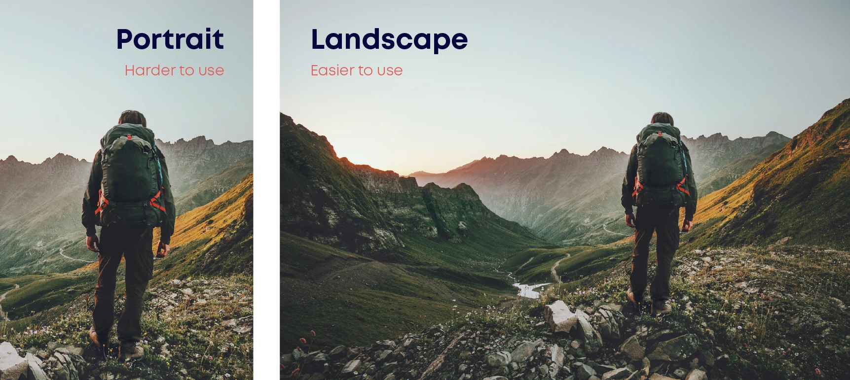
This is for a few reasons – desktop screens (your largest image format) are landscape; you also want landscape if you’re placing text overtop of one side of an image; smartphones need to limit the vertical real estate (so tall images are a problem); page spreads in a magazine are also landscape; the list goes on…
Object Position
Photos with a significant amount of “negative / dead space” are often very advantageous, as these integrate well with text, titles, and full-width layouts.
So rather than framing a shot with the subject in the middle, or taking up the majority of the space, frame most shots with the subject off to one side.
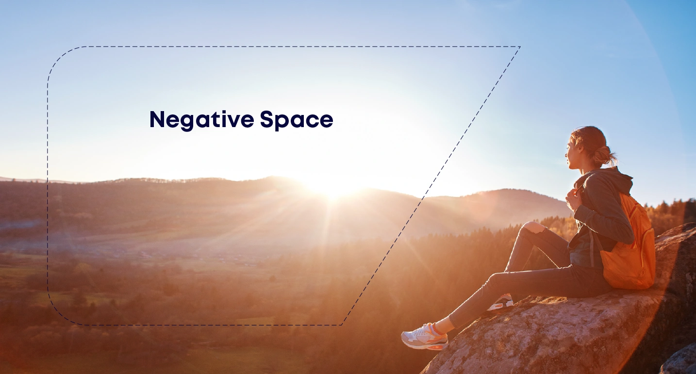
And if we ever need less space in a photo, it’s always easier to crop a photo to be narrower than to “make a photo wider”.
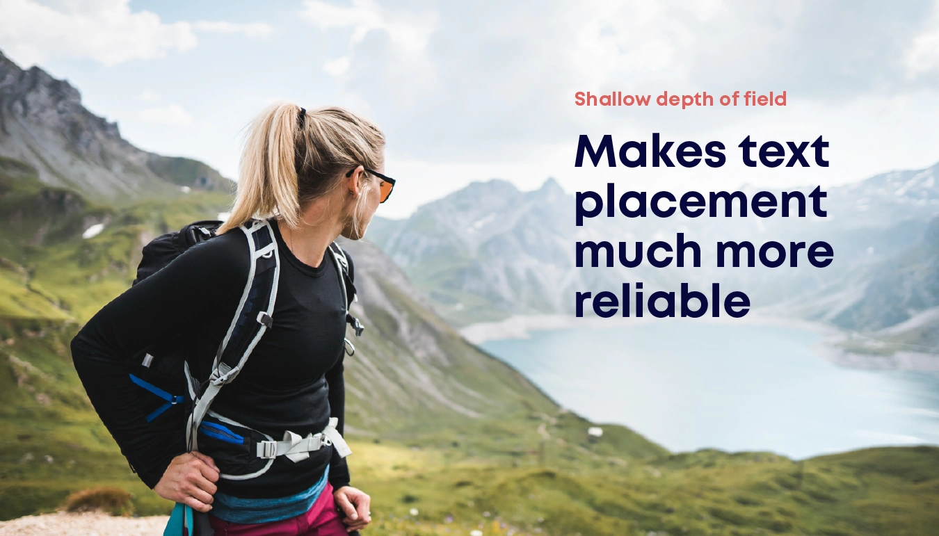
Shallow Depth of Field (i.e. the blurry background effect)
In addition to adding visual emphasis on the subject, photos that make use of a “shallow depth of field” (the subject sharply in focus while the background is blurry) can also be advantageous in design layouts as they often offer greater allowance for text overlays.
“The Face Problem”
When our goal is to have the maximum impact on our audience and connect intuitively with our users, countless User Experience studies have found that photos with people in them will have a distinct advantage.
But there’s a common problem here. Let’s say you have the perfect photo on your website of a smiling employee or customer. Then a year down the road, that employee is let go, or the relationship with the customer deteriorates. Chances are good that all photos featuring that person are now rendered unusable. This happens too often.
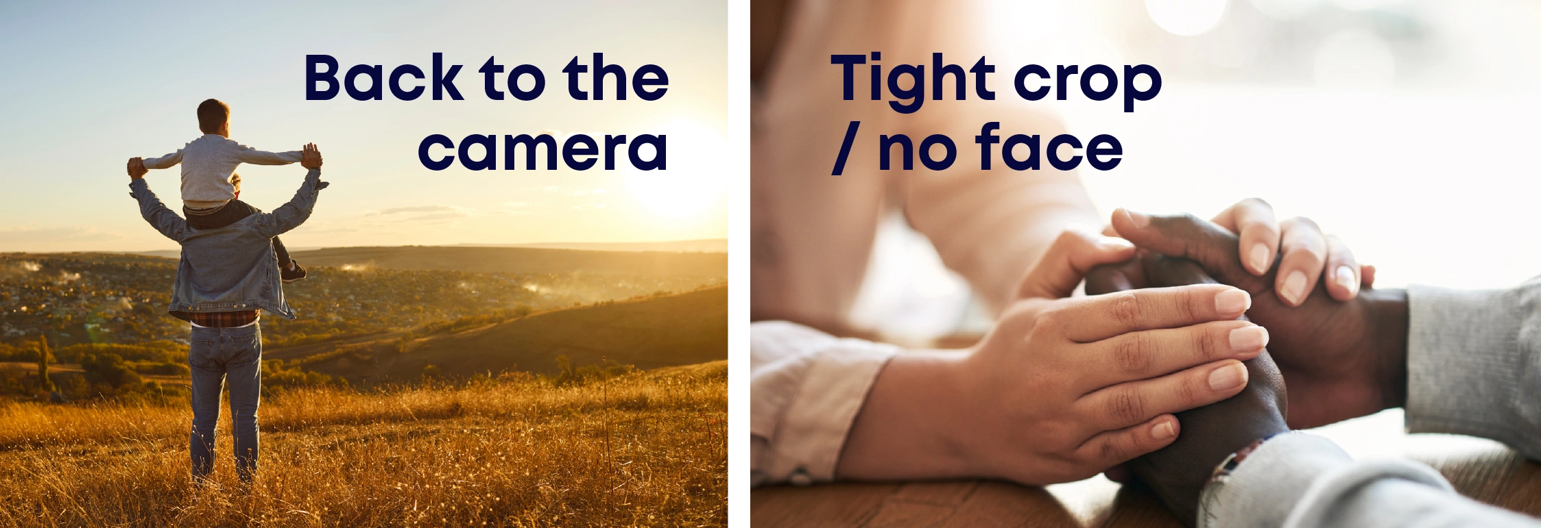
A nice middle ground that avoids this issue while still incorporating the critical human elements in your photography are the “back to the camera” or “tight crop / no face” shots. Shots of this nature show human connection, but are more future-proof because of their lack of identifiable people.
At the end of the day, a good web designer can work magic with just about any professionally shot, well framed, high quality photo, but keeping the above factors in mind can increase the percentage of your photos that end up as long term assets for your company.
3. Reinforcing Your Brand
When we design, one of our primary goals is always to communicate your values and reputation as effectively and powerfully as possible. We’ve all heard the phrase “a picture is worth a thousand words” in which there is an enormous amount of truth – a truth you need to be capitalizing on.
Before heading into your photoshoot we strongly recommend you spend some time on your content strategy. For our team this is step #1 of any major project, but in the very least you should be discussing:
- Who are we building this asset for? (ie. the individual reading it; not just the company they work for)
- What problems are you helping them solve? (remember this is the problem they’re solving; not just the product you’re pushing)
- What do the outcomes of your solution look like? (remember this is “life after the solution”; not the just product which fixed it)
- What do they need to read/see before they’d be willing to take the next step?
The better you can understand your customer and their internal motivations, the better you’ll be able to build a narrative they connect with.
Taking the automotive industry as an example, you’ll find different key themes depending on their audience – some focusing more on safety, some focusing on the experience of driving an open road, and some (more recently) focusing on environmental impact. Every single one of these are moving past “we sell an engine on wheels” and focusing their shots on values-based messages which their audiences care most about.
Before conducting a shoot, take the time to define the message you want to give your audience, and look to capture that in your photography.

