A website is a statement of who you are to prospective clients. But what happens if that experience only works on some devices and fails on others? That’s where responsive design becomes not just a recommendation but a competitive necessity.
Responsive design isn’t a buzzword. It’s a strategic foundation for modern web design that affects visibility, performance, conversions, and long-term growth.
What Is Responsive Design?
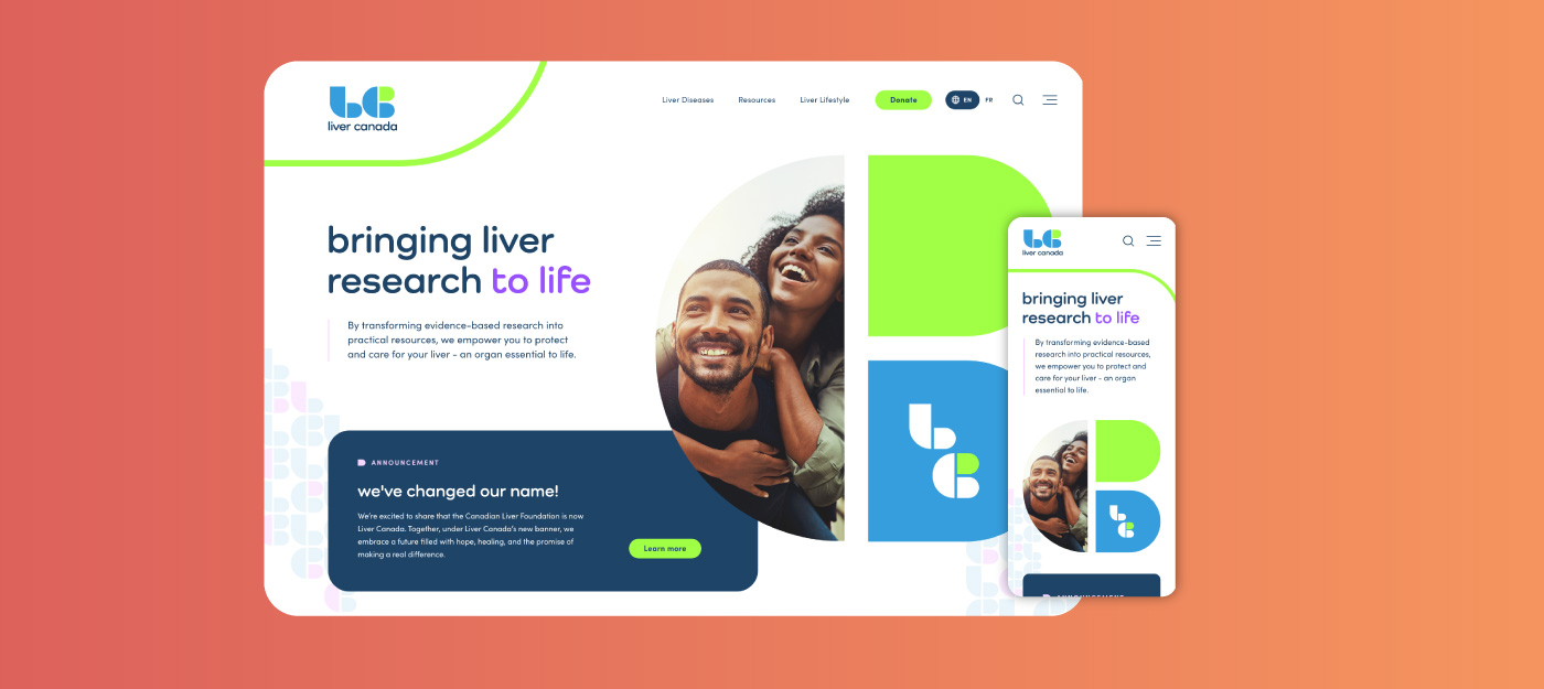
Responsive design is an approach to web design where a website’s layout, content, and elements adapt automatically to fit the screen and device being used. Whether that’s a mobile phone, tablet, laptop, smart TV, or large desktop monitor, it matters. Instead of maintaining separate versions for different devices, responsive design uses flexible layouts, fluid grids, and CSS media queries so your site looks great and works well every time, for every visitor.
In simpler terms: your website responds to your user’s device, hence “responsive design”. No pinching. No awkward scrolling. No broken overlap. Just a seamless experience.

Why Responsive Design Matters for User Experience (UX)
TL;DR – Delivering seamless experiences builds trust and engagement
More than half of all web traffic in 2025 comes from mobile devices. If someone lands on your site and elements are tiny, navigation buttons are hard to tap, or they have to scroll sideways, you are already losing their attention.
Here’s why responsive design matters for UX:
- Landing on a broken website layout lowers trust.
-
Adaptable layouts make content readable and navigable without zooming.
-
Touch-friendly interfaces improve interactions on phones and tablets.
-
Images and navigation scale intelligently, reducing frustration.
-
Users are far more likely to stay, explore, and take action when every device feels like it was designed just for their device.
A bad mobile experience isn’t just annoying, it’s costly. Studies show a significant drop in conversions and user satisfaction when websites don’t adapt.
Responsive Design & SEO: Why Google Prefers It
Better ranking, better visibility, better results
Search engines like Google have shifted to what’s called mobile-first indexing. Meaning Google primarily evaluates your mobile experience when determining search rankings.
Here’s how responsive design impacts SEO:
-
Mobile-first indexing alignment: Your mobile version becomes the basis for rankings, and responsive design ensures consistency across devices.
-
Improved crawlability: One site, one URL easier for search engines to index your content.
-
Lower bounce rates: Google interprets user engagement and dwell time as signals of quality. Responsive sites tend to keep users longer
-
Elimination of duplicate content issues: One responsive site means all inbound links point to the same domain authority.
In other words, responsive design is good for visitors and it’s a practical part of your SEO strategy.
Responsive Design and Site Performance
Speed, reliability, and efficiency
Performance isn’t a nice-to-have, Google treats page speed as a direct ranking factor.
Responsive design helps performance by:
-
Reducing unnecessary redirects
-
Optimizing images and assets for each device
-
Delivering faster load times
-
Improving Core Web Vitals (load speed, layout stability, interactivity)
Fast responsive websites engage users earlier, increase conversions, and reduce bounce.
Business Benefits: Beyond Rankings & UX
Responsive design also matters for business outcomes:
1. Cost-Effective Web Development & Maintenance
You manage one website instead of separate desktop and mobile versions, which means less work, fewer updates, and fewer bugs.
2. Increased Conversions
Visitors who enjoy a smooth mobile experience are more likely to convert, whether that’s filling out a form, purchasing a product, or requesting a quote.
3. Future-Proofing
With emerging devices, screen sizes, and interaction patterns (think foldables and tablets that blur categories), responsive design prepares your site to adapt without requiring a full rebuild.
4. Competitive Advantage
If your competitors aren’t optimizing their user experience on all devices, a responsive website becomes a natural differentiator.

Responsive Design Is No Longer Optional
If your site doesn’t render well on every device, you’re leaving traffic, conversions, and credibility on the table.
Responsive design enhances:
- Search visibility
- User experience
- Load performance
- Conversion potential
- Long-term website ROI
Investing in responsive design means a seamless experience for users on every device, every screen, every time.
If your website isn’t performing the way it should, let’s talk about what’s holding it back and how to fix it.
 - Steve Jobs
Design is not just what it looks like and feels like. Design is how it works.